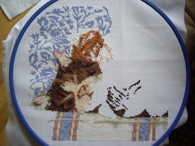
 I have done some more on sleeping cats, the ginger kitten is coming along well, this is a hard piece because there are so many different shades of the same colour, but on the plus side if I do have a stitch out of place, you would not know, I think most of it is where is should be.
 Last night I started a small project, I have wanted a tigerskin rug for my dolls house for ages, so here are the first few stitches, I have taken the pattern from Janet Granger's carpet pattern book.
 Today I'm out to visit my niece and her son Riley, Fliss is still away, but tonight Kev is out so I will stitch all evening.
Teresa is having a 1 year anniversary giveaway for her blog At Willow Tree Pond, you can join here
Love your cushions Marlene.
ReplyDeleteNice progress on the cat and look forward to seeing more of your new start:)
Oh a quiet time at your house tonight! Hope you enjoyed your visit out!
ReplyDeleteThe cushions are pretty. Did you cut the fabric and then place the stitching? I like the way it finishes out! And the cats are coming to life!
The cushions look great! How did you stitch them? It looks like you cut out the middle...and...?
ReplyDeleteLove the cushions!
ReplyDeleteI agree the teddies are too nice to pack away.
Great progress on the cats!
I am looking forward to seeing the tigerskin rug finished. :)
Happy Stitching
Bec
Could you possibly stitch buttons on the corners to hide the fraycheck marks? After all that work, it would be annoying to see it. I don't think matching buttons would look all that out of place
ReplyDelete